New photography website templates – Introducing “Phoenix”
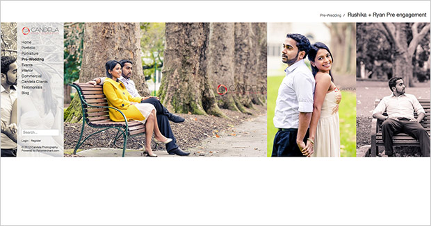
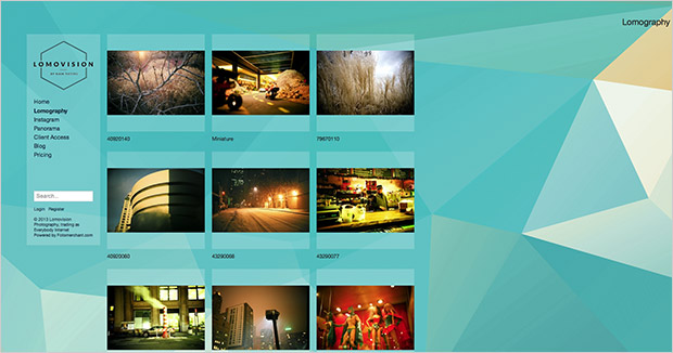
One of the main reasons we re-built Fotomerchant was so that we could more easily develop new and prettier photography website templates. We’re proud to announce “Phoenix” our first new website theme in a long, long time (don’t ask us how long). We’ve taken on your feedback and created a theme with larger thumbnails, that fill the full width of the screen and added some new navigation enhancements. Watch the video below for a complete run down on what Phoenix looks like and how it works or view some live website examples.
Who should use Phoenix?
While we strive to make website layouts that can be used universally, the Phoenix template is designed more for wedding, portrait, commercial and art photographers, but that doesn’t mean it can’t be used for any photographic style. We’ve just made some creative decisions to better target these users.
Phoenix is a landscape, side scrolling and vertically scrolling theme designed to show off your photography portfolio. The theme comes with three new web page layouts and seven new photo layouts that can be customised to show as little or as much information as you need.
Massively enhanced customisation and personalisation options
Phoenix allows you to customise your websites colour and design using simple-to-use colour pickers and menu options. The new theme uses a new template platform that loads faster and only loads new images as your visitors browse your site. The main goal was to increase the performance and make a more beautiful looking website. Here’s a list of new features for Phoenix.
[list type=”list4″]
- Larger logo area designed for more vertical images
- Breadcrumb trail to allow your customers to more easily navigate your nested galleries
- 3x New website layout templates
- 7x New portfolio and gallery templates
- Portfolio and gallery templates use the same layouts for more flexibility and consistency
- Layouts come in horizontal and vertical varieties
- Lazy loading, meaning your visible images load first and the remainder load ‘just in time’ which reduces the stress on your visitors page load and improves the browsing experience
- Full-width preview window now fills 90% of the browser window for even bigger image previews
- Iconographic buttons for Add to Cart, Add to Favourites, Preview and Copy Link.
- Improved font options
- Complete colour control over your headings, body copy, navigation, background colour and navigation panel
- Fixed image background for enhancing your websites design
- And more…
[/list]

Visit candelaphotography.com.au

Visit lomovision.net
What doesn’t it do?
[list type=”list1″]
- Mobile friendly but not yet mobile optimised. Our next goals for the templates is to develop a more mobile optimised experience. Our website templates have always worked on mobile handsets and tablets, but out plan is to give the themes a unique look on mobile and tablets that heighten the viewing and purchasing experience. It’s all part of a larger initiative to take Fotomerchant mobile.
- Phoenix is designed for more modern browsers and more contemporary audiences. If your audience is quite senior or your clients are stuck using older web browsers and computers, you may want to stick with Geneva.
- There is no full-screen slideshow option currently in Phoenix.
- Tags are only visible in the large preview window and cannot be used to filter images in a gallery.
- It is not designed for massive galleries of more than 300 images. We’ believe 250 images per gallery is the largest size before the web browse starts to degrade in performance.
[/list]
What happened to the old templates?
We’ve wrapped up all the current template layouts and bundled them into a single theme called “Geneva”. You can now easily switch between themes by going to Website > Theme and clicking the “view more themes” button. That’s right, by “more” we are implying that there will be new themes coming out in the future.

